2021/06/15
Jetpack Composeで少し凝ったBottom Navigationを実装してみる
今回は、Jetpack ComposeベースのAndroidアプリでBottom Navigationの実装を行った内容の共有になります。
前回の記事ではかなりシンプルな実装までしか試していなかったのですが、
もう少し凝った見た目のものを作る必要が出てきたので、実装してみました。
以下のような感じの見た目になりました。

インジケーター(ナビゲーションメニューのボタンの上部に青いバー)を表示して、メニュー(タブ)を切り替えるとそのインジケーターがスライドするように動くようにしました。
準備
以下のライブラリをインストールしました。
dependencies {
    final def accompanist_version = '0.11.0'
    implementation "com.google.accompanist:accompanist-insets:$accompanist_version"
    implementation "com.google.accompanist:accompanist-systemuicontroller:$accompanist_version"
}
土台を作成
まずは以下のような感じでシングルアクティビティとルートとなるComposableを作成します。
ポイント
MyThemeは自動生成された root-package.ui.theme.Theme.kt のテーマです。WindowCompat.setDecorFitsSystemWindows(window, false)及びProvideWindowInsetsを使っています。- そのためコンテンツエリアでは
com.google.accompanist.insetsの以下のmodifierをうまく使ってステータスバーやナビゲーションバーと被らないように制御する必要があります。(他にもキーボードと被らないようにしたりなど便利な機能が提供されています。)statusBarsPaddingnavigationBarsPadding
- そのためコンテンツエリアでは
class MainActivity : ComponentActivity() {
    override fun onCreate(savedInstanceState: Bundle?) {
        super.onCreate(savedInstanceState)
        WindowCompat.setDecorFitsSystemWindows(window, false)
        setContent {
            Application()
        }
    }
}

@Composable
fun Application() {
    ProvideWindowInsets {
        MyTheme {
            Scaffold(
                bottomBar = {
                    // ここにbottom navigation
                },
            ) { contentPadding ->
                // ここにコンテンツを入れる
            }
        }
    }
}
また MyTheme 内で以下の効果を足しておきます。
@Composable
fun MyTheme(
    darkTheme: Boolean = isSystemInDarkTheme(),
    content: @Composable() () -> Unit
) {
    // ... 省略
    val systemUiController = rememberSystemUiController()
    SideEffect {
        // system barの色を背景色を使ってうっすら透過
        systemUiController.setSystemBarsColor(
            color = colors.uiBackground.copy(alpha = 0.95f)  // Color(0xffffffff).copy(alpha = 0.95f)
        )
    }
    // ... 省略
}
メニューの定義
以下のような感じにしました。
アイコンに使っているベクター画像はheroiconsをダウンロードして使っています。
enum class MenuOptions(
    @StringRes val title: Int,
    @DrawableRes val activeIcon: Int,
    @DrawableRes val inactiveIcon: Int,
    val route: String
) {
    HOME(
        R.string.home,  // home
        R.drawable.ic_home_solid,
        R.drawable.ic_home_outlined,
        "home"
    ),
    COMPONENTS(
        R.string.components,  // components
        R.drawable.ic_template_solid,
        R.drawable.ic_template_outlined,
        "components"
    ),
    ARTICLES(
        R.string.articles,  // articles
        R.drawable.ic_document_text_solid,
        R.drawable.ic_document_text_outlined,
        "articles"
    ),
    SETTINGS(
        R.string.settings,  // settings
        R.drawable.ic_cog_solid,
        R.drawable.ic_cog_outlined,
        "settings"
    ),
}
また、route の定義も以下のような感じにしようかなと検討しています。
home: ホーム画面components: コンポーネント一覧画面components/{id}: コンポーネント詳細画面articles: 記事一覧画面articles/{slug}: 記事詳細画面(slugには記事を特定するIDが入る)settings: 設定画面
Bottom Navigation Barの定義
以下のような感じになりました。
private val BottomNavigationElevation = 12.dp
private val BottomNavigationHeight = 56.dp
private val BottomNavigationItemHorizontalPadding = 12.dp
private val CombinedItemTextBaseline = 14.dp
private val BottomBarTransitionSpec = SpringSpec<Float>(
    stiffness = 800f,
    dampingRatio = 0.8f
)

private val NavGraph.startDestination: NavDestination?
    get() = findNode(startDestinationId)

private tailrec fun findStartDestination(graph: NavDestination): NavDestination {
    return if (graph is NavGraph) findStartDestination(graph.startDestination!!) else graph
}

@Composable
fun BottomBar(
    navController: NavController,
    menus: Array<MenuOptions>,
) {
    val navBackStackEntry by navController.currentBackStackEntryAsState()
    val currentRoute = navBackStackEntry?.destination?.route
    val sections = remember { MenuOptions.values() }
    val routes = remember { sections.map { it.route } }
    if (currentRoute in routes) {
        val activeColor = MyTheme.colors.active  // Color(0xfff0f9ff)
        val inactiveColor = MyTheme.colors.inactive  // Color(0xffa1a1aa)
        val currentSection = sections.first { it.route == currentRoute }
        Box(
            modifier = Modifier
                .shadow(elevation = BottomNavigationElevation, shape = RectangleShape, clip = false)
                .background(color = MyTheme.colors.uiBackground)  // Color(0xffffffff)
        ) {
            BottomBarLayout(
                selectedIndex = currentSection.ordinal,
                itemCount = routes.size,
                modifier = Modifier.navigationBarsPadding(start = false, end = false),
                indicator = { BottomBarIndicator() }
            ) {
                menus.forEach { menu ->
                    val selected = menu == currentSection
                    val animationProgress by animateFloatAsState(
                        targetValue = if (selected) 1f else 0f,
                        animationSpec = BottomBarTransitionSpec
                    )
                    val tintColor = lerp(inactiveColor, activeColor, animationProgress)
                    BottomBarItem(
                        icon = {
                            Icon(
                                painterResource(id = if (selected) menu.activeIcon else menu.inactiveIcon),
                                tint = tintColor,
                                contentDescription = null,
                                modifier = Modifier.size(20.dp)
                            )
                        },
                        label = {
                            Text(
                                text = stringResource(id = menu.title).toUpperCase(
                                    ConfigurationCompat.getLocales(
                                        LocalConfiguration.current
                                    ).get(0)),
                                color = tintColor,
                                style = TextStyle(
                                    fontWeight = FontWeight.Normal,
                                    fontSize = 11.sp,
                                    letterSpacing = 0.4.sp
                                ).copy(textAlign = TextAlign.Center),
                                maxLines = 1
                            )
                        },
                        selected = selected,
                        onSelected = {
                            if (menu.route != currentRoute) {
                                navController.navigate(menu.route) {
                                    launchSingleTop = true
                                    restoreState = true
                                    popUpTo(findStartDestination(navController.graph).id) {
                                        saveState = true
                                    }
                                }
                            }
                        },
                    )
                }
            }
        }
    }
}

@Composable
fun BottomBarLayout(
    selectedIndex: Int,
    itemCount: Int,
    modifier: Modifier = Modifier,
    indicator: @Composable () -> Unit,
    content: @Composable () -> Unit
) {
    // Animate the position of the indicator
    val indicatorIndex = remember { Animatable(0f) }
    val targetIndicatorIndex = selectedIndex.toFloat()
    LaunchedEffect(targetIndicatorIndex) {
        indicatorIndex.animateTo(targetIndicatorIndex, BottomBarTransitionSpec)
    }

    Layout(
        modifier = modifier.height(BottomNavigationHeight),
        content = {
            Box(Modifier.layoutId("indicator")) {
                indicator()
            }
            content()
        }
    ) { measurables, constraints ->
        val itemWidth = constraints.maxWidth / itemCount
        val itemPlaceables = measurables
            .filterNot { it.layoutId == "indicator" }
            .map { measurable ->
                measurable.measure(
                    constraints.copy(
                        minWidth = itemWidth,
                        maxWidth = itemWidth
                    )
                )
            }
        val indicatorPlaceable = measurables
            .first { it.layoutId == "indicator" }
            .measure(
                constraints.copy(minWidth = itemWidth, maxWidth = itemWidth)
            )
        layout(
            width = constraints.maxWidth,
            height = itemPlaceables.maxByOrNull { it.height }?.height ?: 0
        ) {
            // place indicator
            val indicatorLeft = indicatorIndex.value * itemWidth
            indicatorPlaceable.placeRelative(x = indicatorLeft.toInt(), y = 0)

            // place tab bar items
            var x = 0
            itemPlaceables.forEach { placeable ->
                placeable.placeRelative(x = x, y = 0)
                x += placeable.width
            }
        }
    }
}

@Composable
fun BottomBarItem(
    icon: @Composable () -> Unit,
    label: @Composable () -> Unit,
    selected: Boolean,
    onSelected: () -> Unit,
    modifier: Modifier = Modifier,
) {
    Box(
        modifier = modifier.selectable(selected = selected, onClick = onSelected),
        contentAlignment = Alignment.Center,
    ) {
        BottomBarItemLayout(
            icon = icon,
            label = label,
        )
    }
}

@Composable
fun BottomBarItemLayout(
    icon: @Composable () -> Unit,
    label: @Composable (() -> Unit),
) {
    Layout({
        Box(Modifier.layoutId("icon")) { icon() }
        Box(
            Modifier
                .layoutId("label")
                .padding(horizontal = BottomNavigationItemHorizontalPadding)
        ) { label() }
    }) { measurables, constraints ->
        val iconPlaceable = measurables.first { it.layoutId == "icon" }.measure(constraints)
        val labelPlaceable = measurables.first { it.layoutId == "label" }.measure(
            // Measure with loose constraints for height as we don't want the label to take up more
            // space than it needs
            constraints.copy(minHeight = 0)
        )

        val height = constraints.maxHeight
        val containerWidth = max(labelPlaceable.width, iconPlaceable.width)

        val baseline = labelPlaceable[LastBaseline]
        val baselineOffset = CombinedItemTextBaseline.roundToPx()

        val labelX = (containerWidth - labelPlaceable.width) / 2
        val labelY = height - baseline - baselineOffset

        val iconX = (containerWidth - iconPlaceable.width) / 2
        val iconY = height - (baselineOffset * 2) - iconPlaceable.height

        layout(containerWidth, height) {
            iconPlaceable.placeRelative(iconX, iconY)
            labelPlaceable.placeRelative(labelX, labelY)
        }
    }
}

@Composable
private fun BottomBarIndicator() {
    Box(
        modifier = Modifier
            .fillMaxWidth()
            .height(2.dp)
            .clip(RoundedCornerShape(10.dp))
            .background(color = MyTheme.colors.active)  // Color(0xff0ea5e9)
    )
}
ポイント
BottomBarLayoutでindicatorとtabをカスタムレイアウトを使って並べています。- 現在選択中のメニューのindexを
Animatableを使ってステートとして保持しておき、メニューの選択変更が会ったときにインジケーターがスライドして動くような動きをつけました。
Application Composable(Scaffold)に適用
@Composable
fun Application() {
    ProvideWindowInsets {
        MyTheme {
            val menus = remember { MenuOptions.values() }
            val navController = rememberNavController()
            Scaffold(
                bottomBar = {
                    BottomBar(navController = navController, menus = menus)
                },
            ) { contentPadding ->
                NavHost(
                    navController = navController,
                    startDestination = MenuOptions.HOME.route,
                ) {
                    composable(MenuOptions.HOME.route) { backStackEntry ->
                        // TODO ここでホーム画面を表示
                        // Home(....)
                    }
                    composable(MenuOptions.COMPONENTS.route) { backStackEntry ->
                        // TODO ここでホーム画面を表示
                        // Components(....)
                    }
                    composable(MenuOptions.ARTICLES.route) { backStackEntry ->
                        // TODO ここで記事一覧画面を表示
                        // Articles(....)
                    }
                    composable(MenuOptions.SETTINGS.route) { backStackEntry ->
                        // TODO ここで設定画面を表示
                        // Settings(....)
                    }
                    composable("${MenuOptions.ARTICLES.route}/{slug}") { backStackEntry ->
                        val arguments = requireNotNull(backStackEntry.arguments)
                        val slug = arguments.getString("slug")
                        // TODO ここで記事詳細画面を表示
                        // ArticleDetail(....)
                    }
                }
            }
        }
    }
}
少し長くなってしまいましたが、以上になります。
関連する記事
UI ComponentにJetpackComposeを採用したアプリを開発してみました
Jetpack Composeメインのアプリ開発を行いました。アプリ内で紹介しているAvatar Componentの開発方法を紹介します。
[Jetpack Compose]プログラミング言語のシンタックスハイライト
github.com/kbiakov/CodeView-Androidを少し改造して、Jetpack Composeでコードビューを実装してみました
[Jetpack Compose]Analytics / Crashlytics / FCMを導入
FirebaseをJetpack Composeアプリに導入して、プッシュ通知を受取り対応する画面を開くようにしました。またAnalyticsやCrashlyticsも同時に導入しました。
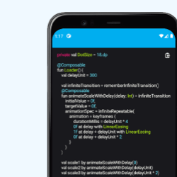
[Jetpack Compose]ローディングアニメーションつきカードコンポーネントの作成
rememberinfinitetransitionをうまく活用し、Jetpack Composeでローディングアニメーションつきのカードコンポーネントを作成しました。