2021/05/19
Jetpack Compose入門・ログイン画面を作ってみる
Android Studio で Jetpack Compose を使用するを見て、Jetpack Composeに入門しました。
SwiftUIのような書き方ができるらしく、今後はこちらが主流になってくるだろうというのもあり、お試しにログイン画面を実装してみました。
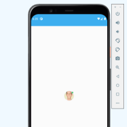
最終的に以下のような画面が完成しました。

環境設定
Android Studioのインストール
Android Studio PreviewでCanary build版のAndroid Studio(Preview)をダウンロードします。
ダウンロード後、zipファイルを解凍してアプリケーションフォルダに移動して終わりです。
新規プロジェクト作成
- File > New > New Project から Empty Compose Activity のテンプレートを選択して、Nextをクリック
- Project Name / Package Name / Min SDK Versionを適当に入力してFinishをクリック
初回はビルドが走るので結構(数分)待ちます。
e: This version (1.0.0-alpha13) of the Compose Compiler requires Kotlin version 1.4.30 but you appear to be using Kotlin version 1.4.32 which is not known to be compatible.  Please fix your configuration (or `suppressKotlinVersionCompatibilityCheck` but don't say I didn't warn you!).

FAILURE: Build failed with an exception.
なぜかビルドエラーがでます。
kotlinのバージョンが少し新しいみたいなので、kotlinのバージョンを推奨されている1.4.30に落としてあげます。
// Top-level build file where you can add configuration options common to all sub-projects/modules.
buildscript {
    ext {
        compose_version = '1.0.0-beta01'
    }
    repositories {
        google()
        mavenCentral()
    }
    dependencies {
        classpath "com.android.tools.build:gradle:7.0.0-alpha15"
        classpath "org.jetbrains.kotlin:kotlin-gradle-plugin:1.4.30"

        // NOTE: Do not place your application dependencies here; they belong
        // in the individual module build.gradle files
    }
}

task clean(type: Delete) {
    delete rootProject.buildDir
}
ログインページの開発
以下をLoginPage.ktとして定義しておきます。
以下をサポートしています。
- 画像
- メールアドレスの入力項目
- パスワードの入力項目
- パスワードの表示/非表示の切り替えボタン
- ログインボタン(ボタン押した時の操作は未実装のため、押しても反応しません)
package com.kumanote.composetutorial.composables

import androidx.compose.foundation.Image
import androidx.compose.foundation.layout.*
import androidx.compose.foundation.shape.RoundedCornerShape
import androidx.compose.foundation.shape.ZeroCornerSize
import androidx.compose.foundation.text.KeyboardOptions
import androidx.compose.material.*
import androidx.compose.material.icons.Icons
import androidx.compose.material.icons.filled.Email
import androidx.compose.material.icons.filled.Lock
import androidx.compose.runtime.Composable
import androidx.compose.runtime.mutableStateOf
import androidx.compose.runtime.remember
import androidx.compose.ui.Alignment
import androidx.compose.ui.Modifier
import androidx.compose.ui.graphics.Color
import androidx.compose.ui.res.painterResource
import androidx.compose.ui.text.input.KeyboardType
import androidx.compose.ui.text.input.PasswordVisualTransformation
import androidx.compose.ui.text.input.VisualTransformation
import androidx.compose.ui.tooling.preview.Preview
import androidx.compose.ui.unit.dp
import com.kumanote.composetutorial.ui.theme.Primary500
import com.kumanote.composetutorial.R
import com.kumanote.composetutorial.ui.theme.Shapes

@Preview(showBackground = true)
@Composable
fun LoginPage() {

    val emailState = remember { mutableStateOf("") }
    val passwordState = remember { mutableStateOf("") }
    val passwordVisibility = remember { mutableStateOf(false) }

    Box {
        Surface(color = Primary500, modifier = Modifier.fillMaxSize()) {

        }
        Surface(
            color = Color.White,
            modifier = Modifier
                .height(600.dp)
                .fillMaxWidth(),
            shape = RoundedCornerShape(20.dp).copy(topStart = ZeroCornerSize, topEnd = ZeroCornerSize)
        ) {
            Column(
                modifier = Modifier.padding(16.dp),
                horizontalAlignment = Alignment.CenterHorizontally
            ) {
                val modifier = Modifier.fillMaxWidth().padding(horizontal = 16.dp)
                Image(
                    // drawableで呼び出す画像は、事前に画像     ファイルをAndroid Resource Managerを使ってリソースファイルとして取り込んでおきます。
                    painter = painterResource(id = R.mipmap.kuma),
                    contentDescription = "kumanote"
                )
                Spacer(modifier = Modifier.padding(16.dp))
                OutlinedTextField(
                    value = emailState.value,
                    onValueChange = { emailState.value = it.trim() },
                    label = { Text("Email") },
                    leadingIcon = { Icon(Icons.Filled.Email, contentDescription = "Email") },
                    modifier = modifier
                )
                Spacer(modifier = Modifier.padding(6.dp))
                val image = if (passwordVisibility.value)
                    painterResource(id = R.drawable.design_ic_visibility)
                else
                    painterResource(id = R.drawable.design_ic_visibility_off)
                OutlinedTextField(
                    value = passwordState.value,
                    onValueChange = { passwordState.value = it.trim() },
                    label = { Text("Password") },
                    leadingIcon = { Icon(Icons.Filled.Lock, contentDescription = "Password") },
                    modifier = modifier,
                    visualTransformation = if (passwordVisibility.value) VisualTransformation.None else PasswordVisualTransformation(),
                    keyboardOptions = KeyboardOptions(keyboardType = KeyboardType.Password),
                    trailingIcon = {
                        IconButton(onClick = {
                            passwordVisibility.value = !passwordVisibility.value
                        }) {
                            Icon(painter = image, "eye")
                        }
                    }
                )
                Spacer(modifier = Modifier.padding(vertical = 12.dp))
                Button(
                    onClick = {
                              // TODO ここにdispatcherを定義して呼び出します。
                    },
                    colors = ButtonDefaults.buttonColors(
                        backgroundColor = Primary500,
                        contentColor = Color.White
                    ),
                    shape = Shapes.medium,
                    modifier = modifier,
                    contentPadding = PaddingValues(16.dp),
                ) {
                    Text(text = "Sign In")
                }
            }
        }
    }
}
こちらをMainActivityから呼び出して表示します。
class MainActivity : ComponentActivity() {
    override fun onCreate(savedInstanceState: Bundle?) {
        super.onCreate(savedInstanceState)
        // ステータスバーを隠します。
        val windows = this.window
        windows.statusBarColor = Color.WHITE
        setContent {
            ComposeTutorialTheme {
                // A surface container using the 'background' color from the theme
                Surface(color = MaterialTheme.colors.background) {
                    LoginPage()
                }
            }
        }
    }
}
References
- Compose Foundation | Android デベロッパー | Android Developers
- Compose のリソース | Jetpack Compose | Android Developers
以上です。
関連する記事
UI ComponentにJetpackComposeを採用したアプリを開発してみました
Jetpack Composeメインのアプリ開発を行いました。アプリ内で紹介しているAvatar Componentの開発方法を紹介します。
[Jetpack Compose]プログラミング言語のシンタックスハイライト
github.com/kbiakov/CodeView-Androidを少し改造して、Jetpack Composeでコードビューを実装してみました
[Jetpack Compose]Analytics / Crashlytics / FCMを導入
FirebaseをJetpack Composeアプリに導入して、プッシュ通知を受取り対応する画面を開くようにしました。またAnalyticsやCrashlyticsも同時に導入しました。
[Jetpack Compose]ローディングアニメーションつきカードコンポーネントの作成
rememberinfinitetransitionをうまく活用し、Jetpack Composeでローディングアニメーションつきのカードコンポーネントを作成しました。